You are using an out of date browser. It may not display this or other websites correctly.
You should upgrade or use an alternative browser.
You should upgrade or use an alternative browser.
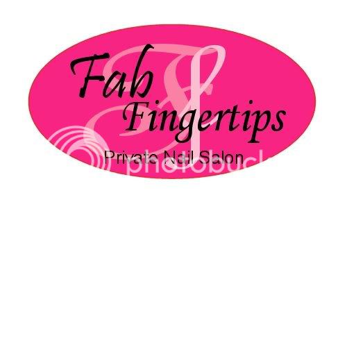
Logo, opinions please?
- Thread starter dottie
- Start date

Help Support SalonGeek:
This site may earn a commission from merchant affiliate
links, including eBay, Amazon, and others.
La Femme Nails
Member
Hi Dottie,
The logo looks great. You could try to move the background 'ff' up slightly so the Privat Nail Salon stands out.
Colours look really nice...
The logo looks great. You could try to move the background 'ff' up slightly so the Privat Nail Salon stands out.
Colours look really nice...
brittone05
Well-Known Member
I would personally use the capital F shadowed twice rather than 1 large and 1 small - it is slightly distracting to the eye?
It is lovely in all though - I adore pink
It is lovely in all though - I adore pink
I would personally use the capital F shadowed twice rather than 1 large and 1 small - it is slightly distracting to the eye?
It is lovely in all though - I adore pink
I agree. Nice logo!
geeg
Judge Gigi-Honorary Geek
I think you've done a great job and I like the upper and lower case F's .... eye catching (distracting) is a GOOD thing!
*Ang*
Well-Known Member
I think you've done a marvellous job, well done to you. Very colourful and eye catching
Posted via Mobile Device
Posted via Mobile Device

$89.99 ($45.00 / Count)
$129.99 ($65.00 / Count)
NIOIIKIT Modern Velvet Dining Chairs Set of 2 Hand Weaving Accent Upholstered Side Chair with Golden Metal Legs for Dining Room Kitchen Vanity Living Room (Rosered)
Mary's Sweet Home

$31.99 ($1.33 / Count)
$36.99 ($1.54 / Count)
Orighty Black Salon Towel, Pack of 24(Not Bleach Proof, 16 x 27 Inches) Super Soft and Absorbent Microfiber Hair Salon Towels for Salon, Hand, Gym, Bath, Spa and Home Hair Care
Orighty Care

$39.59 ($1.65 / Count)
$47.99 ($2.00 / Count)
Utopia Towels - Salon Towel, Pack of 24 (Not Bleach Proof, 16 x 27 Inches) Highly Absorbent Cotton Towels for Hand, Gym, Beauty, Spa, and Home Hair Care, Black
Amazon.com
LadyL
Well-Known Member
I've been trying to design a new logo i will take a look at this application.
personally i would amend the 'F' in the word Fingertips to be lower case as in the initials.
Lisa
personally i would amend the 'F' in the word Fingertips to be lower case as in the initials.
Lisa
Verve Designs
TAFNO Extensionize
I'd fade the FF in the background slightly as they're a little full on (only the lower case one actually...)- but well done 
Also, did you design it as 300dpi and CMYK? otherwise it might print an entirely different scale and colour- which defeats the object a tad if you're trying to create a "brand".
You might find it hard to replicate that pink in print (or if you send it away to be printed on biz cards etc) if you've designed it in RGB- as that's for the web. Your monitor has a light source so it can show really vivid colours, but obviously print doesnt.
Last edited:
Ruth Mills
Well-Known Member
And my recommendation is to save it as a PNG (Portable Network Graphics) file rather than a JPG. This will give you a clearer image. JPEG images are usually a bit fuzzy and "blocky" round the edges...
Thank you all for your advice and comments. Extensionize you were absolutely right. My logo is printing a vile shade of red. Ive tweaked the settings for my printer and it's better but still not the lovely shade of pink I want. Ive tried changing it in PSP to the settings you recommended but it hasnt made much difference. I'm really disappointed and I'm wondering now if I should get the logo professionally designed. I'd appreciate your thoughts. Many thanks
Verve Designs
TAFNO Extensionize
The problem is that you'll never get that vivid shade of pink in print- It's impossible because on this screen theres a light making it "bright". The printer isn't the problem- and nor is changing the settings..its too late once it's done in RGB mode! 
So, you're choice (I guess) is to have a seperate colour for the web and print- or rethink the colour and go for one that matches in both mediums.
So, you're choice (I guess) is to have a seperate colour for the web and print- or rethink the colour and go for one that matches in both mediums.
redsadie
Well-Known Member
I'm really disappointed and I'm wondering now if I should get the logo professionally designed. I'd appreciate your thoughts. Many thanks
I would - definately! Carl won't promote himself on here but I can!!! I think I am quite techsavvy when it comes to pc's n the like but when it comes to a professional looking logo that prints correctly, I have no clue!
Here is his website address verve design. Take a look :green:


