Help me pick my poster

SalonGeek

Help Support SalonGeek:

This site may earn a commission from merchant affiliate links, including eBay, Amazon, and others.

Which poster do you think is the best for my salon?

  • Poster 1

    Votes: 67 65.0%
  • Poster 2

    Votes: 0 0.0%
  • Poster 3

    Votes: 16 15.5%
  • Poster 4

    Votes: 20 19.4%

  • Total voters
    103

grafxgal

Well-Known Member
Joined
Aug 1, 2005
Messages
1,756
Reaction score
115
Location
NZ
Hi guys,
decided to let all my lovely geeky friends help me pick which photo was best for a poster.
Please select from the choices below:
Poster 1:
poster1_edited-1copy.jpg

Poster 2:
poster2_edited-1.jpg

Poster 3:
poster3_edited-1.jpg

Poster 4:
poster4_edited-1.jpg
 
Wow ... they're all great, but I think I prefer the 1st one as a poster the best.
 
Like no:1 but without the earings!
Or no:3 well done they are fab!!!! xx
 
Out of them all, I prefer the first one. I like the contrast of the white flowers with the colours you have used on the nails. The only thing that I am not keen on is the ear-rings......may sound silly,but it was the thing that stood out to me. Hth
 
Cheers.:hug:
I have removed the earrings from poster 1, does that look okay/better?
 
Number one for me I just think it is much more focused on the hand and nails :hug:
 
Sorry about the writing, but was advised to copyright.
 
The pics are all fantastic, I put no 4 - for me the picture is more about the nails than your model and her body art!

All really amazing though!:hug:
 
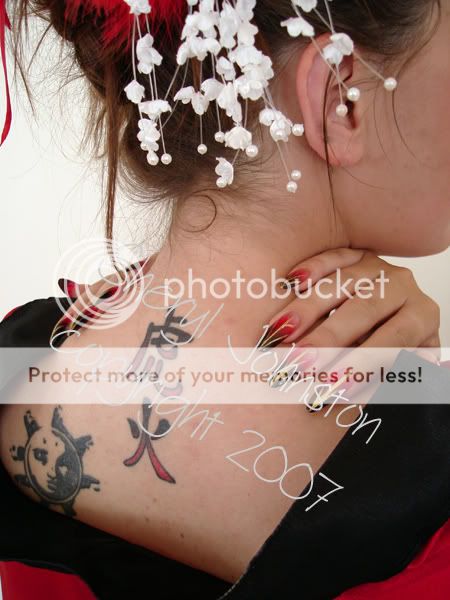
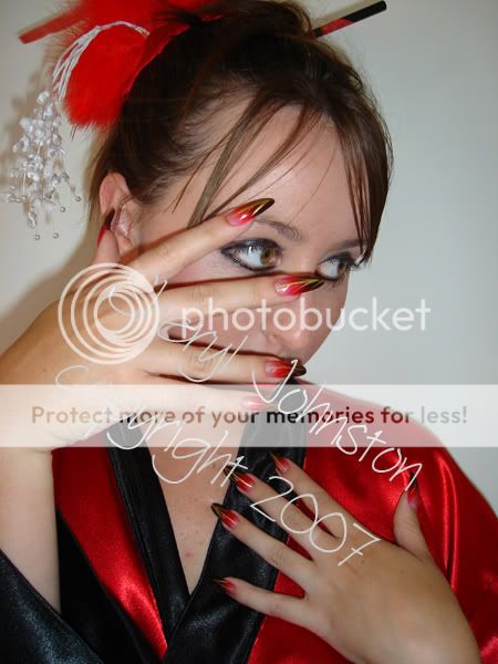
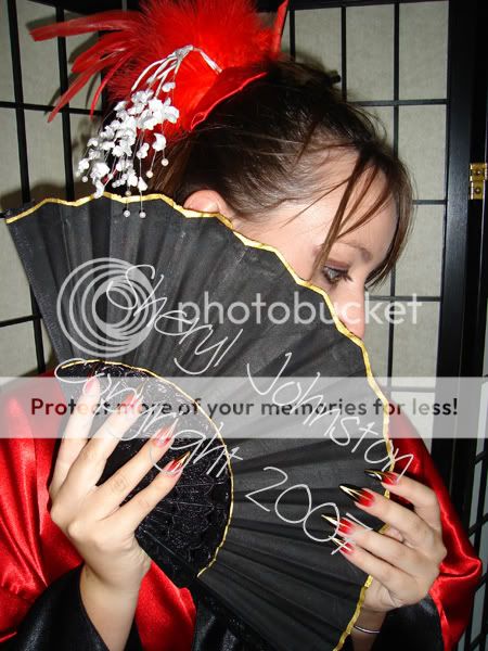
out of these four , i like no 4 the best , its more about the nails ,
but is there anyway that you can blank out the background? i think it would look better plain, would draw the attention even more to the nails.

i also love the sample photo you put on the critique section though y'know hun , but again jewellry and background removed :lol:
 
i have put no 1 , i really lkie em all but this really stands out to me the most , ,well done they are fantastic xx
 
Number one for me I just think it is much more focused on the hand and nails :hug:

I put number one for this reason too. And in 2 and 4 I think the effect of the colour fade is lost against the black of the fan. HTH
 
The pics are all fantastic, I put no 4 - for me the picture is more about the nails than your model and her body art!

All really amazing though!:hug:

I agree with this too.

Far more emphasis is on the nails here. Deffo pic 4 for me too.
The background is in keeping with the style of the picture, as a japanese screen, I think it goes well.
I know it's best to copywrite the pics, but it's nice to see the nails too, I feel that some of the writing coversx the nails a little too much, but maybe that's because I'm a nail tech and like to scrutinise the nails!!!:lol:
 
The first one its lovely x
 
They are all really nice! I like number 3 the best tho!
 
It looks better now the ear-rings have gone!
 
Number 3 for me too.
 
no 4 for me but with a different, lighter background if possible.
 
I like no3 best as i think it draws the eye to the nails, which is what the poster is about.

It was a decision between 1 and 3 for me, but no1 kept me looking at the tattoos, which im not keen on!

Great Nails BTW!
 

Latest posts

Back
Top